New North America Data Models Released to WattTime API
TL;DR
- Model 2026-03-01 released for ‘CO2 MOER’ and ‘Health Damage’ signals
- Most API users will automatically get the new data on Mar 18 when it becomes default
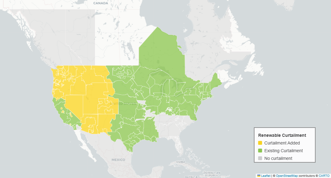
- Renewable curtailment detection is added in 25 new regions
- Improved forecast models are more accurate and 3.3% more impactful on average
- Models are retrained on newer data to better reflect how grids have changed over time
- The new model is being released through WattTime’s new model transition process
- The CO2 reduction opportunity has increased by ~25% overall in North America
What’s new in model ‘2026-03-01’?
We’ve released a new model for all of North America (US, Canada, Mexico), for our CO2 MOER and Health Damage signals (Health Damage is still only available in the US).
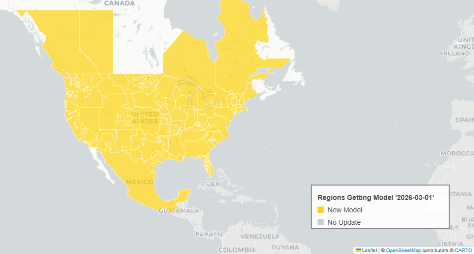
More renewable curtailment: As grids reach higher levels of renewable energy, these grids start to turn off and waste some, at times when supply exceeds demand. More regions are now wasting renewables, so we’ve added curtailment detection in these regions. 25 grids in the Western Interconnect have joined the Western Energy Imbalance Market, which enables more efficient interchange between them and creates a signal (LMP price signal) for assessing renewable curtailment that didn’t previously exist. Additionally, one grid in Colorado (PSCO) has joined a similar market, the WEIS, which also provides an LMP price signal. We’re now using LMP data in these regions to infer when curtailment is happening, resulting in MOER values of zero lbs/MWh.
Improved forecast performance: Our research team has made improvements to our ML model selection pipeline, weather input features, and curtailment predictions. The resulting changes are not always dramatic, but we’ve measured improved performance as judged by higher accuracy (lower MAE), higher rank correlation, higher F1 scores (more balanced precision/recall), and increased total CO₂ reduction in load-shifting simulations.
Retrained to reflect grid changes: We’ve retrained the model on newer data so it now better reflects how grids operate today. Electric grids change over time as new power plants or transmission lines are built, old power plants are retired, or new markets are formed - all of these changes affect how a grid operates and responds to loads. For example, between 2021 and 2024, total generation output from coal decreased 27% while natural gas generation increased 18%.
Renewable curtailment values: Prior models applied renewable curtailment probability as a derate factor on the MOER, in some cases resulting in low non-zero MOERs. The new model applies curtailment as a boolean mask (fully applied, or not at all), which means more zero values in places with curtailment.
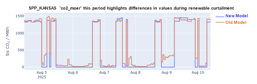
How will the data be different? MOERs with a zero value due to renewable curtailment will be newly present in 25 grids, and there will be more zero values in regions that already had curtailment. The shifting marginal fuel mix from coal to gas will affect the seasonal and diurnal variation patterns in higher ranges of MOERs in some regions.
These changes to the range and distribution of values could cause disruptions to your products if you use static thresholds. Please reach out to us if you think the changing data might cause problems, and we can help you understand the changes in more detail and identify solutions. The availability of overlapping data for old and new models allows you to make comparisons and any necessary adjustments.
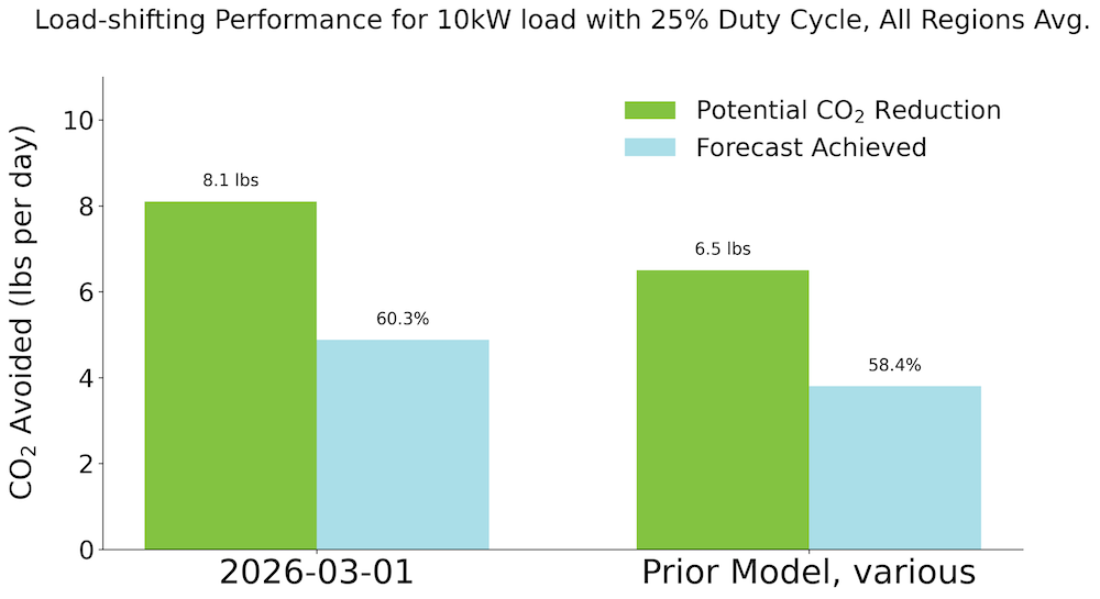
Overall results? Better CO2 reductions: In one of our standard load-shifting performance simulations (10 kW daily load shifting with a 25% duty cycle for one year), we found that optimizing with the forecast captured 3.1% more of the emissions-reduction potential than the prior model. The same simulation showed that the potential CO₂ reduction opportunity increased by ~25% on average across all regions. Performance improvements were seen in our other simulations as well. Overall, this means that we’re detecting more of the grid’s CO2 swings, leading to bigger potential CO2 reductions, and the improved forecast is enabling more of that opportunity to be captured.
Why do we upgrade data models?
WattTime uses empirical models to estimate emissions from electricity grids. We occasionally upgrade these models to improve the impact and accuracy of our signals. Some reasons why we may deploy a new model include:
- WattTime’s research team developed a new modeling method with better accuracy
- We incorporated a new data source, enabling a higher-quality model to be used (see “Model Hierarchy” for background)
- Enough time has passed since the prior model training that the grid has structurally changed, and the range and/or distribution of the signal has significantly changed when trained on more recent data.
When deploying a new model, we issue a new “model date” which serves as the unique identifier in the API. Note that, between model upgrades, we may also simply retrain models on newer data, and when the model output change is less significant, we won’t issue a new model date. These model retrains can be more frequent and are intended to reduce drift between how the grid operates today and how it operated during the historical training period.
How is the new model rolled out?
We support over 1B IoT devices globally, and we roll out new models carefully to avoid potential disruptions. That process has been further refined with this release to provide our partners with a smoother transition when models are upgraded. This section explains the rollout timeline for this model upgrade and serves as the template for model upgrades going forward.
Release timeline
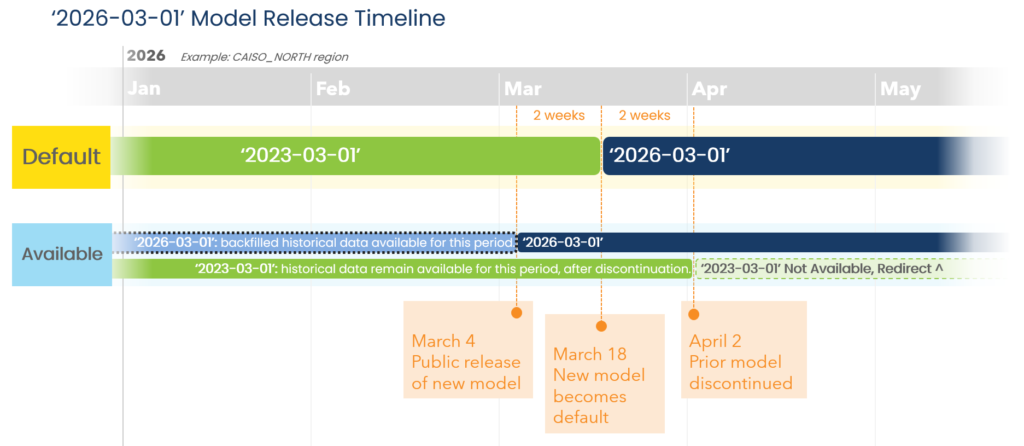
March 4, 2026: The new model ‘2026-03-01’ is available for the CO2 MOER and Health Damage signals. Backfilled data for the new model is available for 2+ years for MOER, and data is generated in real time.
March 18, 2026 (+2 weeks): The new model ‘2026-03-01’ becomes the default. Recurring API calls that use the default model (omit the optional ‘model’ parameter) will automatically switch from returning the prior model’s data to returning ‘2026-03-01’ data. Data is still generated in real time for both the old and new models. Either model can be requested using the optional ‘model’ parameter in API queries.
April 2, 2026 (+2 weeks): The prior model is discontinued, meaning new historical and forecast data will not be generated for it. Data from the prior models for the period prior to discontinuation will still be available. Only data for the new model will be generated going forward.
For API users: To receive data for the newest model version from the API, most users will not need to make any changes to the way they pull data (the API itself is not changing). On March 18, 2026, the new model ‘2026-03-01’ will become the default and data from that model will be returned for requests that omit the optional ‘model’ parameter. If you’d like to access the data before Mar 18, you must specifically request it by using ‘2026-03-01’ for the model parameter. If you currently use the optional ‘model’ parameter, be aware that on April 2, 2026, no new data will be produced for the old models being replaced (e.g. 2023-03-01 and 2022-10-01), and any queries specifically for those models for a period after discontinuation will be redirected to the new model.
What’s next?
We’re excited to share this new, more impactful data with the world. We hope the new model release process provides our users with a smooth transition. We’re also better prepared to retrain our models more frequently so that real-time data more accurately reflects how grids are transforming over time.
We’re open to your feedback on this rollout and how we’ve communicated it. Please reach out if you need any support!